
Soft Pastels Done Right: A Fresh Summer Interior Trend
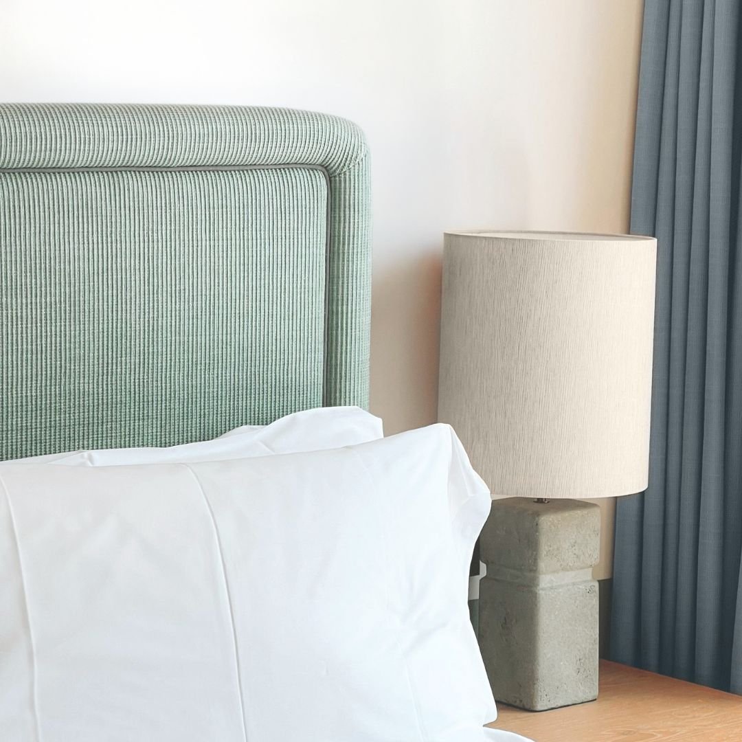
Soft pastels are having a major moment in interior design, and it is easy to see why.
After years of cooler greys and stark neutrals, many homeowners are looking for spaces that feel lighter, warmer, softer, and more personal. Pastels offer a fresh way to bring colour into the home without overwhelming a room.
When done well, soft pastels can feel calm, modern, and elevated. They are especially effective in spring and summer, when natural light, fresh textures, and seasonal styling already make homes feel brighter and more inviting.
The key is knowing how to use them intentionally.
Why Pastels Work So Well in Spring and Summer
Pastels naturally feel connected to the warmer months. Soft blue, butter yellow, muted green, pale blush, lavender, and peach can all bring a sense of freshness to a space.
They work well because they add colour without feeling too bold. They can soften a room, brighten a neutral palette, and make a home feel more current.
For homeowners, pastels are an easy way to refresh a space without committing to a major change. For sellers, they can add warmth and personality while still keeping the home broadly appealing.
Start With a Neutral Base
The best way to use pastels is to pair them with a strong neutral foundation.
Warm whites, creamy beige, soft taupe, light greige, natural wood, and linen textures all help pastels feel refined rather than overly playful. Without that neutral base, pastels can sometimes feel too sweet or too themed.
For example, a soft blue pillow on a cream sofa feels fresh and elegant. A pale yellow vase on a natural wood console feels seasonal and intentional. A muted green throw in a white bedroom adds just enough colour without overpowering the space.
Balance is everything.
Use Pastels as Accents, Not the Entire Story
One of the most common mistakes with pastels is using too much at once.
For a more sophisticated look, choose one or two pastel tones and use them as accents. Pillows, artwork, florals, ceramics, bedding, towels, and small décor pieces are all easy ways to bring pastel colours into a space.
This approach is especially helpful when staging a home for sale. Buyers generally respond well to spaces that feel fresh and styled, but not too personal or distracting.
A little colour can make a room memorable. Too much colour can make it harder for buyers to imagine their own belongings in the space.
Soft Blue: Calm and Classic
Soft blue is one of the easiest pastels to work with because it feels calm, clean, and timeless.
It works beautifully in bedrooms, bathrooms, living rooms, and coastal-inspired spaces. Pair it with white, beige, light wood, linen, and subtle black accents for a look that feels fresh but grounded.
In staging, soft blue can help create a restful feeling, especially in a primary bedroom or guest room.
Butter Yellow: Cheerful but Subtle
Butter yellow is one of the trendiest pastel tones for spring and summer.
It brings warmth and optimism without feeling too bright. The trick is to keep it soft and muted. A butter yellow floral arrangement, pillow, lamp, or piece of artwork can make a room feel sunny and welcoming.
This colour works especially well in kitchens, breakfast areas, front entries, and outdoor entertaining spaces.
Muted Green: Fresh and Natural
Muted green is a great choice for anyone who wants to bring a nature-inspired feeling into the home.
It pairs beautifully with wood tones, woven textures, stone, cream, and warm white. Because green is associated with nature, it can make a room feel grounded and restorative.
In spring and summer staging, muted green works well through plants, artwork, bedding, or subtle accessories.
Blush and Pale Pink: Warm and Soft
Blush and pale pink can feel elevated when used carefully.
Rather than making a space feel overly feminine or decorative, blush can act almost like a warm neutral. It pairs well with cream, taupe, beige, brass, natural wood, and soft grey.
A blush pillow, floral arrangement, or piece of art can bring warmth to a room without taking over the design.
How Sellers Can Use Pastels When Staging
If you are preparing your home for the market, pastels can help your listing feel seasonal, bright, and thoughtfully styled.
The key is restraint.
Use pastels to create small moments throughout the home: a soft throw in the living room, fresh towels in the bathroom, light bedding in the bedroom, or florals on the kitchen island.
Avoid painting entire rooms in trendy pastel shades right before listing unless the colour is very subtle and widely appealing. Instead, keep larger surfaces neutral and use pastels through accessories.
This keeps the home feeling fresh while still allowing buyers to imagine their own style.
Easy Ways to Add Pastels at Home
You do not need a full redesign to try this trend.
Start with small, affordable updates:
Swap darker pillows for lighter seasonal ones.
Add a pastel vase or ceramic bowl.
Use fresh or faux florals in soft colours.
Change bathroom towels to a lighter tone.
Add pastel artwork to a neutral wall.
Use a soft throw at the end of a bed.
Style a patio table with pastel napkins or dishes.
These small updates can make your home feel more connected to the season without requiring a long-term commitment.
Final Thoughts
Soft pastels are one of the easiest ways to bring a fresh spring and summer feeling into your home.
When paired with warm neutrals, natural textures, and clean styling, they can feel modern, calm, and elevated. Whether you are styling for yourself or preparing to sell, pastels can help a home feel brighter, softer, and more inviting.
The secret is to keep it simple. Use colour with intention, layer it with texture, and let the rest of the space breathe.